Monday, 8 November 2010

Tess Beighton - Identity

Halftones & Headphones
www.halftonesandheadphones.com

These are some of the better identities I've found to show Tess tomorrow, I think it's easy to go for something standard and I obviously don't want that to be the case. These designs don't really do anything for our limited budget, but I'm pretty sure she'll quite like the overall style here. The logos are quite intricate and fun looking, I think that will be favoured over the more simplistic style that I'm accustomed to.
This style also lends itself quite nicely to screen printing, where the misalignment is part of the design and adds a personal quality not unlike the service shes providing.


Wednesday, 20 October 2010

Wire Design - Minty & Friend

The intriguing part for me here is how the brand seems to be a mish-mash of colours and typefaces.. I think the key to making this kind of brand work is repetition.. So each seemingly thrown together aspect of this design is repeated - kept constant and unchanging, whilst the colours and layouts change around them.

http://www.wiredesign.com/


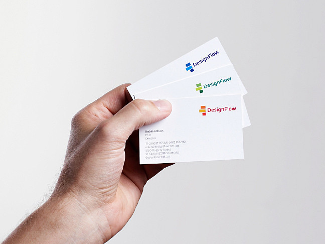
Hofstede - Design Flow


Though corporate by nature, stationary doesn't have to look that way. This is a really nice example of how fun and inventive branding can work across something as typically bland as a letterhead.

http://www.hofstede.com.au/

Tuesday, 12 October 2010

5 Identities - Fashion House

SAWDUST - www.madebysawdust.co.uk

I wanted this fashion logo to be more than just the standard sans serif nicely laid out type. I've opted for something similar to the below, block shapes that are representative of the company name - but with an added element that can act as the identity through the range. These guys have gone for a swirl that has then been applied to posters and flyers and the like, I'm going to do something with the '&' element - and have that act as the brand.


5 Identities - Record Label

Divided logo

The swing tag for this range of clothing looks far better, I'll upload a photo when I get chance.
I love the strike through used here - I tried to get something similar going for the record label brand.. but it's interesting how the strike through alone could act as an identity.. being applied to imagery and type through a range of media. Will be trying this with record label brand i have already developed.

Monday, 4 October 2010

5 Identities - Record Label

5 Identities - Fashion House


Contextual mood board focusing on the fashion house identity. Note how none of these logos have anything to do with fashion as such - and instead have come to define what fashion means. i.e. just because it's a bank doesn't mean the logo has to look like money - instead the big bank logos come to define the industry.. This is true all across the board.