Saturday, 27 February 2010

Collaborative - The Monster Engine

Dave Devries work is based around interpreting children's drawings into a more realistic evironment. The drawings are reworked and then carefully painted, shaded and toned to give a sinister and realistic edge to something so innocent. Though the paintings themselves are of interest, it is more this process of interpreting a child's point of view that I could potentially help the development of this project.


It's strange how these images turn out so damn scary. But then I guess the deformed characters on the paper lend themselves to a slightly sick recreation of themselves.


Will and I hope to work with children in this way to help us generate ideas around how to visually interpret an imagination. How can we be the judges of what is imaginative? It's been a long time since we were children, and every day the limits of the real world cloud our own imaginative visions.. Children are generally more inquisitive, ignoring the rules of what is and is not possible - allowing them to explore their imaginations far more thoroughly and without fear of looking stupid.
So it seems only natural to try and harness this resource... it also fits with our target audience - how can we tell a child what is or is not imaginative? A child's influence seems quite necessary.

On this note then, just to test the waters, I empolyed the creative talents of my 9 year old little sister. She fits the target audience perfectly - as she is in no way a girly girl! I like to think she learns from the best.
I asked her to come up with a really short story around whatever he favourite thing was that day - and illustrate it a bit. Nothing too taxing.
She decided on dragons, and this is what she came up with! 


It's a bit difficult to decipher, but you get the gist of the humour through the illustrations. 
The plates of identical meals signal quite a sophisticated sense of humour for a child of 9, and this is by no means the limit to it. Quite a useful exercise anyway.
 Thanks Jodie! x

Collaborative - Cartoon Network

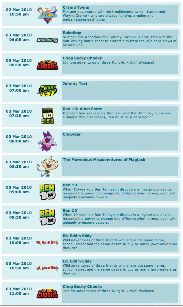
Channel listings for two days shown on Cartoon Network.
It would seem the funny, dark humoured Cartoon Network we all know and love is being taken over by the corporate money making machine that is the Ben 10 phenomenon. There are now 3 versions of this show, including a proposed real time version.
When will this madness stop? How can they justify promoting their website with images of the old days - Johnny Bravo, The Powerpuff Girls, Dexter's Lab - when not a single one of these shows has any air time over an entire weeks schedule?

Tuesday


Wednesday


Monday, 8 February 2010

Top 10 - 'Chuck' title sequence

Though essentially the same idea, there is one major difference between the animation here and my own - the stickman below moves in a 3D space, as he is a 3-dimensional character. His legs are cylinders not just flat shapes. This is something I would have loved to create for my own character, though I have no idea how I might've gone about it. I assume a different piece of software would've been necessary. Anyway, though I'm not a huge fan of the execution of this video, but the fact the the character moves in a 3D environment brings an extra dimension to the piece, and enhances the video as a whole.

Tuesday, 26 January 2010

Top 10 - Change of Brief

So this is where the change of brief has lead me. The sequence tells a story as the two characters chase their way around an ever changing series of events and circumstances. I would like to achieve something similar within my own work.

Wednesday, 20 January 2010

Movie Season - Platform

Not really relevant to any of my design decisions, but I've decided on the channel to host my zombie movie season. Living Tv has a very varied audience, all tuning in for one thing it seems, to see Yvette Fielding scare the living hell out of herself in Most Haunted.
Though my idents seek to bring an air of comedy to a usually terrifying genre, I still think this channel offers the best range of potentially interested viewers. Plus, the logo offers a good range of possibilities when it comes to incorporating it into my own designs and the name brings another edge of black humor.

Anyway, I thought I'd post the idents as I've always liked them, and I found out that there are no digital effects included in them (except maybe touch ups) . The idents were created by blasting fire or smoke through a steel stencil. Amazing!


Tuesday, 19 January 2010

Movie Season - Olly Moss

T-shirt designs by Olly Moss for Threadless,  - Website


I like the dry humor created when delivering information on a situation as horrific as the one depicted below, or making up the rules to a game that isn't even a game, let alone a game that needs rules.
This is definitely the direction I want to take my own work, it's also reassuring that I can still take this idea in both directions, as funny as this could be,
 it could also be really eerie - serious public information detailing what to do in the event of a zombie attack seems pretty scary to me - brings it home, makes it seem possible.
But I'm dead set on making this work as a comedy piece, so I'll exhaust that option first.


I also quite like the delivery of these two posters...


This one has made up document codes and plenty of other official looking
elements that, despite it initially looking quite funny, has 
quite a haunting effect with it's blunt and rational approach to zombie slaughtering.


This one looks scarier, quite text heavy with a newspaper stay layout.
However upon reading there's some line's that sum up the tone of my own approach and some useful 
information I may be able to use when constructing my own info graphic.


Promotional material for 28 Weeks Later
faded and worn effects imply rapid and wide spread distribution


Movie Season - Visual Material

Still trying to figure out an appropriate range of visual material to work with, I began to thing of a few of the elements in the films that I found particularly scary or funny, something that made an impression. I think official documents have a particularly unnerving feel to them, especially newspapers. The idea that a newspaper might print a headline announcing a zombie attack makes the threat seem real.. and what if I applied this to a standard daily tabloid like The Sun?


I could take this idea down either route, either funny or serious.


After a bit of research I came across this image,


Which straight away reminded me of the Eurotrip title sequence...


Though I've seen this many times before, I hadn't considered using it in my own work until now.
I think this is the best approach to my chosen movie season, giving it an edge of black comedy and setting it apart
from the work of others. Brilliant.