Whole Education branding by Wire Design - www.wiredesign.com
This is awesome.
Based on the education system producing well rounded individuals - instead of the focus being on typically academic achievement.
Sunday, 5 December 2010

View Creative
I really like the approaches used by View Creative when it comes to branding. It's less about a logo and more about a general feeling or look when the brand is viewed as a whole.
This one below is very small scale, just web based I think, but the striking red and black make a potentially boring subject matter really quite intriguing.
I was considering using a muted colour palette for this D&AD brief, but I'm tempted to go in the opposite direction now.
www.viewcreative.co.uk
INTERNATIONAL CERAMICS FESTIVAL:



This one below is very small scale, just web based I think, but the striking red and black make a potentially boring subject matter really quite intriguing.
I was considering using a muted colour palette for this D&AD brief, but I'm tempted to go in the opposite direction now.
www.viewcreative.co.uk
INTERNATIONAL CERAMICS FESTIVAL:


S4/C WELSH LANGUAGE CHANNEL:


Friday, 3 December 2010


Thursday, 2 December 2010
The Partners
Design agency I'm looking at in relation to a D&AD brief - it's really hard to get an idea of the work they do through photos, but they're a really influential branding agency where the branding goes far deeper than just a logo or a theme. It's worth reading through a few of their case studies anyway, it's a refreshing way to go about branding.
www.thepartners.co.uk


www.thepartners.co.uk


Thursday, 18 November 2010
B&W - Republic
I've always absolutely loved the Republic branding and it suddenly hit me that a lot of my work is inspired by this simple approach to logo design, so I thought I'd better make it known.
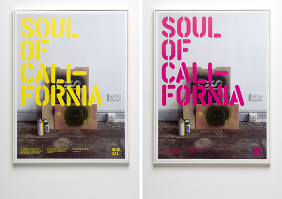
Nearly all the clothing labels sold in Republic have been designed by the same studio (B&W), and though they are all different, they all work together in a way that defines the shop as a whole.
Republic Branding


Crafted Jeanswear


Soul Cal


Nearly all the clothing labels sold in Republic have been designed by the same studio (B&W), and though they are all different, they all work together in a way that defines the shop as a whole.
Republic Branding


Crafted Jeanswear


Soul Cal




Monday, 8 November 2010
Tess Beighton - Identity
Halftones & Headphones
www.halftonesandheadphones.com
These are some of the better identities I've found to show Tess tomorrow, I think it's easy to go for something standard and I obviously don't want that to be the case. These designs don't really do anything for our limited budget, but I'm pretty sure she'll quite like the overall style here. The logos are quite intricate and fun looking, I think that will be favoured over the more simplistic style that I'm accustomed to.
This style also lends itself quite nicely to screen printing, where the misalignment is part of the design and adds a personal quality not unlike the service shes providing.


www.halftonesandheadphones.com
These are some of the better identities I've found to show Tess tomorrow, I think it's easy to go for something standard and I obviously don't want that to be the case. These designs don't really do anything for our limited budget, but I'm pretty sure she'll quite like the overall style here. The logos are quite intricate and fun looking, I think that will be favoured over the more simplistic style that I'm accustomed to.
This style also lends itself quite nicely to screen printing, where the misalignment is part of the design and adds a personal quality not unlike the service shes providing.


Wednesday, 20 October 2010
Wire Design - Minty & Friend
The intriguing part for me here is how the brand seems to be a mish-mash of colours and typefaces.. I think the key to making this kind of brand work is repetition.. So each seemingly thrown together aspect of this design is repeated - kept constant and unchanging, whilst the colours and layouts change around them.
http://www.wiredesign.com/


http://www.wiredesign.com/


Subscribe to:
Posts (Atom)