Whole Education branding by Wire Design - www.wiredesign.com
This is awesome.
Based on the education system producing well rounded individuals - instead of the focus being on typically academic achievement.
Sunday, 5 December 2010
View Creative
I really like the approaches used by View Creative when it comes to branding. It's less about a logo and more about a general feeling or look when the brand is viewed as a whole.
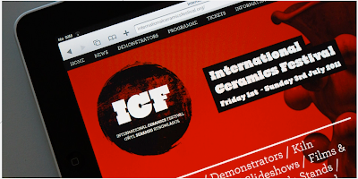
This one below is very small scale, just web based I think, but the striking red and black make a potentially boring subject matter really quite intriguing.
I was considering using a muted colour palette for this D&AD brief, but I'm tempted to go in the opposite direction now.
www.viewcreative.co.uk
INTERNATIONAL CERAMICS FESTIVAL:
S4/C WELSH LANGUAGE CHANNEL:
Friday, 3 December 2010
Thursday, 2 December 2010
The Partners
Design agency I'm looking at in relation to a D&AD brief - it's really hard to get an idea of the work they do through photos, but they're a really influential branding agency where the branding goes far deeper than just a logo or a theme. It's worth reading through a few of their case studies anyway, it's a refreshing way to go about branding.
www.thepartners.co.uk
www.thepartners.co.uk
Subscribe to:
Comments (Atom)


