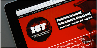
This one below is very small scale, just web based I think, but the striking red and black make a potentially boring subject matter really quite intriguing.
I was considering using a muted colour palette for this D&AD brief, but I'm tempted to go in the opposite direction now.
www.viewcreative.co.uk
INTERNATIONAL CERAMICS FESTIVAL:
S4/C WELSH LANGUAGE CHANNEL:


No comments:
Post a Comment